8 Tips for Managing Fear and Uncertainty
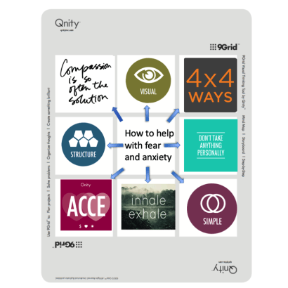
Qnity shares tips for managing fear and uncertainty using their 9 Grid.
by Qnity
I like the clean design of this upscale spa’s homepage.I was recently on a salon website (I don’t want to embarrass the owner by saying which one) and it had me squinting to the point that
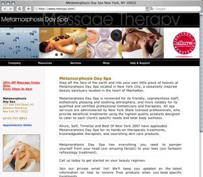
I like the clean design of this upscale spa’s homepage.
I was recently on a salon website (I don’t want to embarrass the owner by saying which one) and it had me squinting to the point that I eventually give up on it entirely. The site used a fancy cursive font in an effort to appear quaint, I think, and to give it a personal touch. The resulting web pages were difficult and occasionally impossible to read.
It got me thinking about web “don’ts.” Thanks to Google, I quickly zeroed in on a really good list of do’s and don’ts at http://www.secretsites.com/do_dont_part1.jsp . If you have a website and want to make sure it looks professional, I recommend you scan the article in its entirety. But here, in brief, are some of the no-no’s I thought were worth passing along:
• No page counters.
• Forget blinking or flashing text.
• Don’t try any stupid cheat tricks in an attempt to fool the search engines.
• Don’t waste your time on Flash intros.
• Don’t use background music on your web pages.
• Don’t create automatic pop-up windows.
• Don’t center everything on your web pages.
• Don’t use busy backgrounds on your pages.
• Don’t set your type to all capital letters in your body text.
• Don’t have more than a few words in italics.
• Don’t have more than a few words in a bold case.
• Don’t use too many colors in your website.
— Judy
Qnity shares tips for managing fear and uncertainty using their 9 Grid.
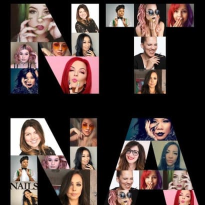
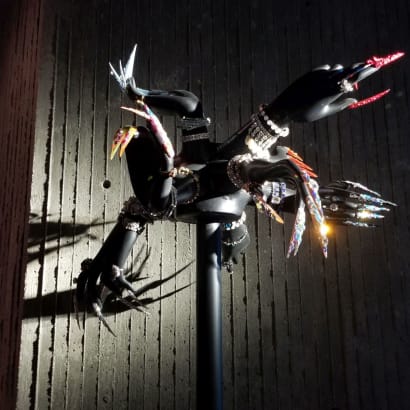
The viral Don't Rush Challenge has spawned many nail spin-offs. NAILS NTNA alum took on the challenge for the ultimate social media post.

Last night's Virtual Happy Hour on Instagram Live with Ashley Gregory, Salon Coach, gave us a ton of information. Here are just five things we learned.

NAILS introduces Virtual Happy Hour each Thursday at 5 pm PST during quarantine.

Amy Masters interviewed Director of Brand Content Strategy, Beth Livesay, on Tech Talk Live.
Director of brand content strategy, Beth Livesay, talks with CND co-founder and style director Jan Arnold about CND and BCL's COVID-19 Relief Grants.
Swarovski's Fall/Winter trends include classic styles, casual looks, natural inspiration, and more.
WeWork has become a popular concept when it comes to doing business. For Pattie Yankee, a salon emergency caused her to secure a space for nail entrepreneurs in need.
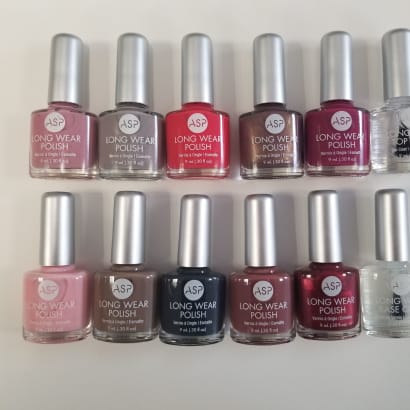
Five readers can enter to win ASP's new long wear polish.
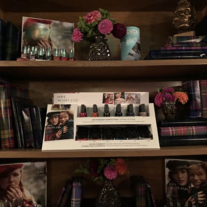
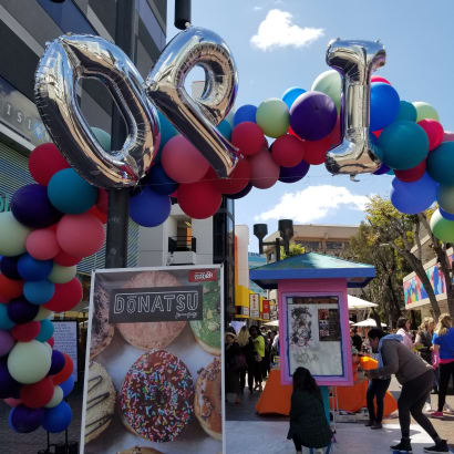
OPI invited the NAILS team and other local influencers to toast the launch of OPI Scotland.
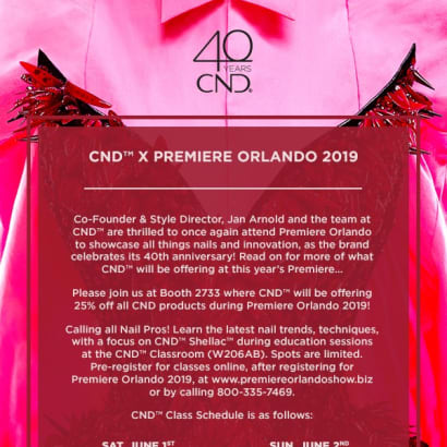
CND will offer deals on products and education on nail trends and techniques at Premiere Orlando June 1-3.
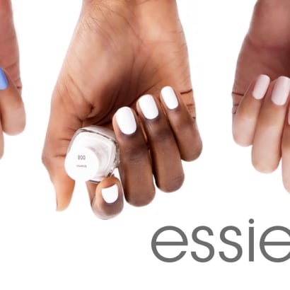
Essie is celebrating its third National Nail Polish Day with a sweepstakes!
Premiere Orlando attendees this year have the exciting opportunity to compete in Nailympia, a globally recognized competition brand.
OPI commissioned a mural in the Los Angeles Little Tokyo neighborhood, with colors inspired by the brand's Tokyo collection.
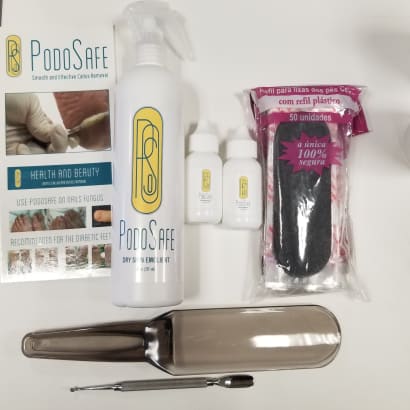
Enter to win PodoSafe Callus Remover, plus a selection of pedicure implements.

Morgan Taylor partnered with Rodarte for a star-studded garden party at the Huntington Library on Tuesday.
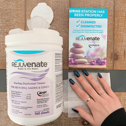
Rejuvenate Disinfectant Wipes effectively clean and disinfect nail salon surfaces and foot baths in as little as one minute without the use of harsh chemicals. Comment for a chance to win!