“This season’s color palette emphasizes this need for balance, while at the same time allowing for individuality, self-expression, and excitement," says Leatrice Eiseman of the Pantone Color Institute.
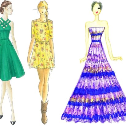
The spring 2013 palette mixes dynamic brights with novel neutrals to create a harmonious balance, according to the Pantone Color Institute.
With an unexpected mix of darks, brights, and neutrals, designers manipulate reality to transport consumers to an enchanting place, free from the stresses of everyday life, according to the Pantone Color Institute.
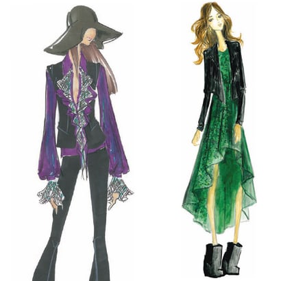
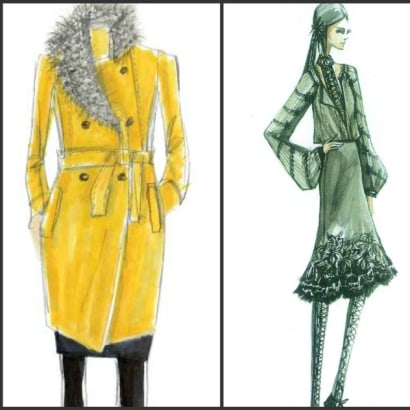
From love potions and the magical hour of sunset to witches and warlocks, fantasy and illusion are inspiring designers this fall.
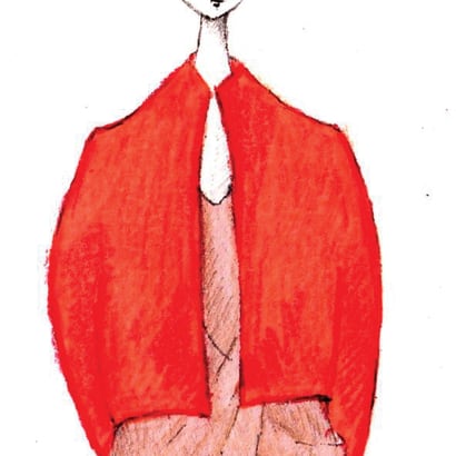
Spring colors likewise reflect differing moods, encapsulating vivid brights, soft muted tones, and fun-loving pastels.
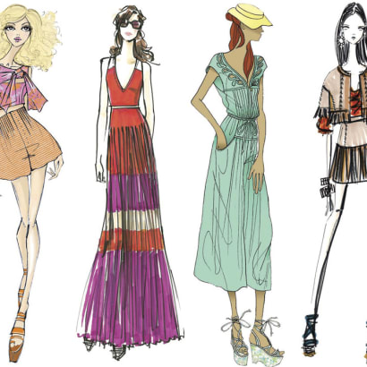
For spring 2012 designers are inspired by diverse influences, showcasing a range of styles and lifestyles — from free and playful to light and breezy, plus contemporary classics.
Designers are paying close attention to texture, contrast, and color for fall 2011, according to the Pantone Institute.
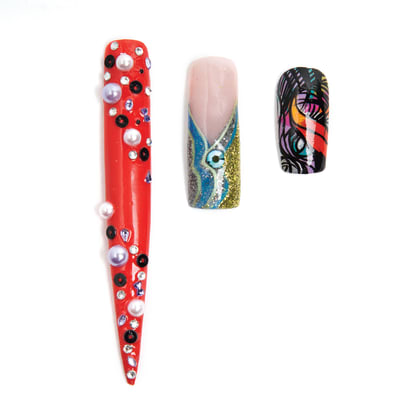
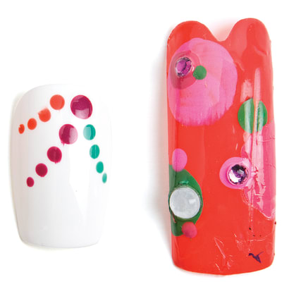
Three nail artists create nail art inspired by the Pantone Color Institute's predicted Spring 2011 color palette.
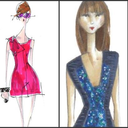
For spring 2011, designers continue to satisfy consumers’ need to escape everyday challenges with intriguing color combinations that transport them to foreign lands.