Grab passers-by's attention with good graphics, a simple message, and a clear message.
by Staff
February 1, 2005
3 min to read
Signs are the most affordable means of advertising for many businesses, and most businesses — new or not — don’t have a dollar to waste. They create a first and lasting impression on clients, and the beauty is once they’re up, they’re always on the job for you, advertising 24 hours a day, 365 days a year. The U.S. Small Business Administration offers the following design tips to get the most bang for your signmaking buck.
1. Keep it visible and legible. Remember that people of all ages are looking through a windshield, in traffic, day and night. They must be able to see and read your sign easily.
Ad Loading...
2. Save the details for the sale. Don’t attempt to sell them with information on the sign — save that information until they are in your business.
3. Keep it simple. Crowding the sign with too many words or lines of text makes it impossible to read from a distance. Use as few words as possible so your signage is legible. Three to five words are optimal for quick readability.
4. Grab attention. There should be something about the sign that will reach out and command attention. Ideally, the first read should be a large pictorial (a graphic or your company logo), but it can also be large dominating text.
5. Your sign is your handshake. Your sign is your handshake with the buying public, and first impressions are lasting impressions. Your sign must project the image you want the public to have of you.
6. Appeal to impulse buyers. Many owners mistakenly think of a sign as merely a device that identifies the business. What they fail to realize is that 55% of all retail sales are a result of impulse buys. People see, shop, and buy.
Ad Loading...
7. Keep it near the viewer. Put the sign as close to the street as allowable.
8. Make sure your sign is conspicuous. Your message competes in a complex environment. A passerby must be able to differentiate your sign from its surrounding environment.
9. Avoid obstructions. Make certain the sign can be viewed without obstruction from any source. Drive past your business from all directions to help determine the most visible location for your sign.
10. Consider colors carefully. Too many colors take away from the quick readability of the sign. Again, stay simple. Make sure colors are contrasting. If you have several colors in a graphic, stay away from multi-colored lines of text or words. Black text is better.
11. Consistent visual image. Ideally, the design and the colors of your building should reinforce the design and colors of your sign (and vice versa).
Ad Loading...
12. Avoid clutter. “White-space” is the surface area of a sign's face that is left uncovered by either text or graphics. The proper amount of white space is just as important for quick readability as graphics, text, and colors. Leave 30% to 40% of the sign’s face area white space for optimal readability.
Square data shows that regular customers tip 11% higher and are shared across 32% of businesses in the same ZIP code, driving thousands of dollars in additional revenue per connection.
When Bowie Lau and Jeffrey Ching opened JBW Jeffrey Ching Salon in 2011, they weren’t just launching another luxury hair destination—they were building a business rooted in passion, artistry, and thoughtful growth.
Inside the Systems That Power an Elevated Salon Experience
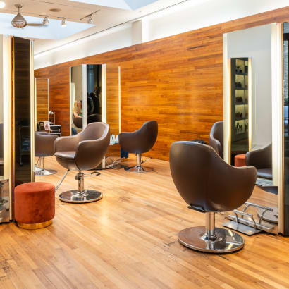
From seamless online booking to a team-first culture, J Gold Salon in Atlanta offers more than great hair—it delivers consistent, high-touch service with the help of partners like Boulevard and American Express.
Want to grow your career as a beauty professional? K18 Sales Manager Sabrina Sanborn shares advice on networking, mentorship, and self-advocacy—from attending hair shows to finding the right guidance to reach your goals.
A combination of clear policies, effective communication, and strong client relationships has helped me create a more reliable and efficient booking system.
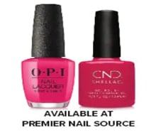
Founded by Cleveland serial entrepreneur Shaura Rodgers, Nailtorious has grown to include a nail supply megastore, training facilities, and retail line for nail techs.
This period after the holidays can bring on a huge lull for hairstylists. We asked Cosmo Prof's team of professionals to offer their best advice on how to deal with the January-February slow period.
Key highlights include a push toward inclusive spaces for all abilities, an emphasis on maximizing livable square footage, and a continued love for modern farmhouse exteriors.
The busy holiday season is here, and with it comes jam-packed days, last-minute client requests and booming retail sales. For many salon owners, the highlight of the season is Small Business Saturday® (SBS). This year on Saturday, November 30, consumers can take their shopping into the small businesses in their communities.
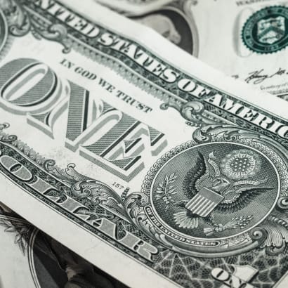
Want to become savvy about your personal finances, but don't quite know where to start? Anna Manukyan identifies six important concepts for building a strong financial foundation.
Salon owner Nuri Yurt had a dream of owning a salon on New York City’s Madison Avenue. "Through perseverance, hard work and stellar customer service, he and partner John Kaygisiz founded Toka Salon in 2007.
Vagaro has consistently been at the forefront of salon software technology, helping businesses be more efficient, create more effective communication, and even improve company culture. Now, Connect by Vagaro, the platform’s two-way communication capability, and Vagaro’s new generative AI tools are giving owners new opportunities to grow and expand.
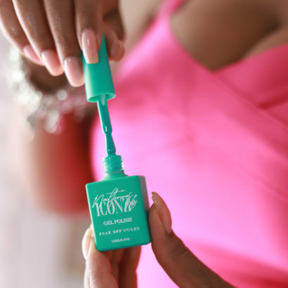
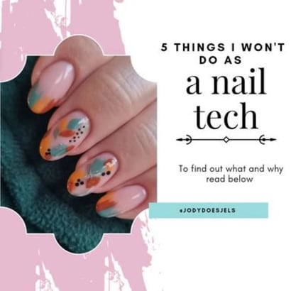
This list of watch-outs from @jodydoesjels prompted us to reach out to her and learn more. We had already fallen for her hand-painted designs and now we wanted to know more about this list she created to help clients decide if she was the nail tech for them.
Education is necessary for beauty professionals to maintain their cosmetology licenses, and paying for that education can be burdensome, but it doesn't have to be. Understand which education tax credits can help you offset those costs.